30% off sitewide w/ code :: sitewide30
30% off sitewide w/ code :: sitewide30
Add description, images, menus and links to your mega menu
A column with no settings can be used as a spacer
Link to your collections, sales and even external links
Add up to five columns
Add description, images, menus and links to your mega menu
A column with no settings can be used as a spacer
Link to your collections, sales and even external links
Add up to five columns
3 Ways to Light Your Backdrop to Create Different Looks with Julia V. Photography
September 24, 2022 3 min read
When planning a shoot we always consider multiple aspects: wardrobe, backdrops, props, lighting, etc. There are so many ingredients in our cocktails and in my opinion, there’s really no right or wrong yet no ingredient carries more weight than lighting. After all, in photography, lighting truly is everything. We must consider lighting our subjects first and foremost but also lighting our set as a whole.
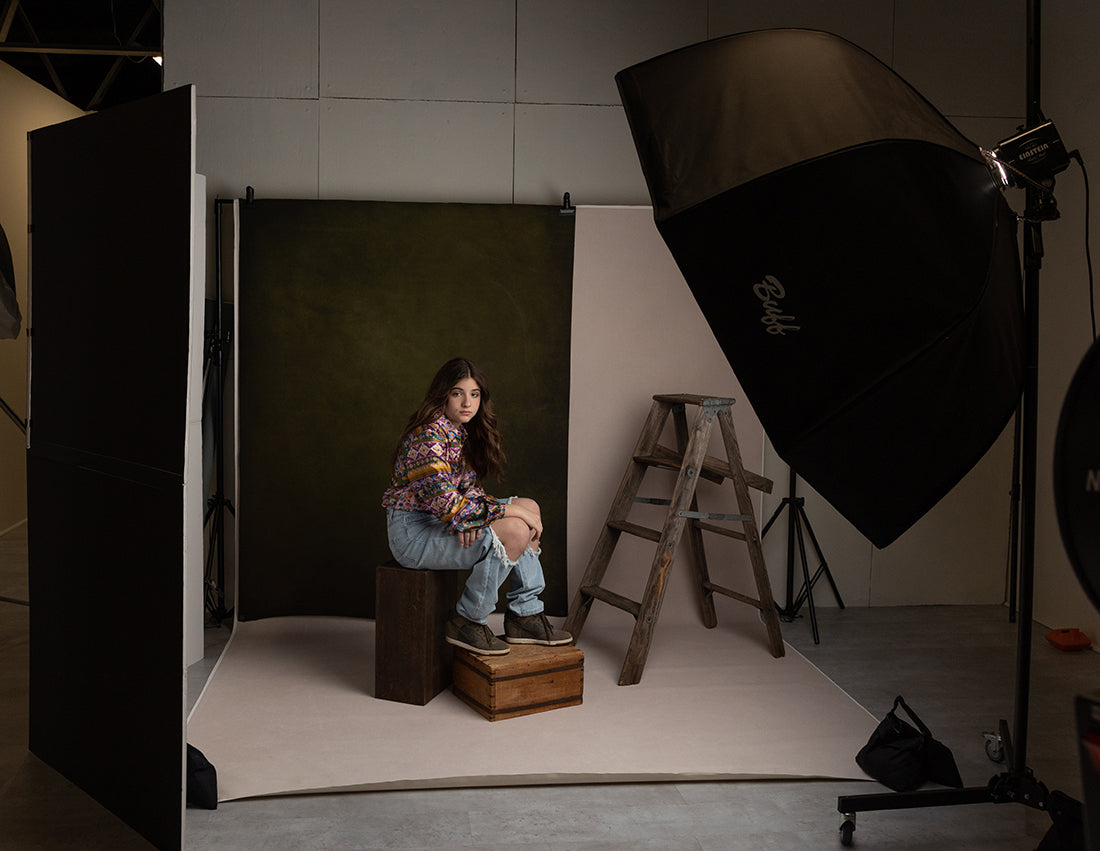
Let’s first describe the set and then we’ll get into lighting. In this set, I used a larger canvas drop - this one is 8x12’. I really like the 12’ length so I get more of the seamless look (wall and floor). The drop I used in this shoot is called "Porcelain" and it’s a very pale pink. I paired it with a smaller 5x7’ canvas in a deep green called "Noelle Mirabella". The layers add depth, color and interest and also coordinate with the models wardrobe.
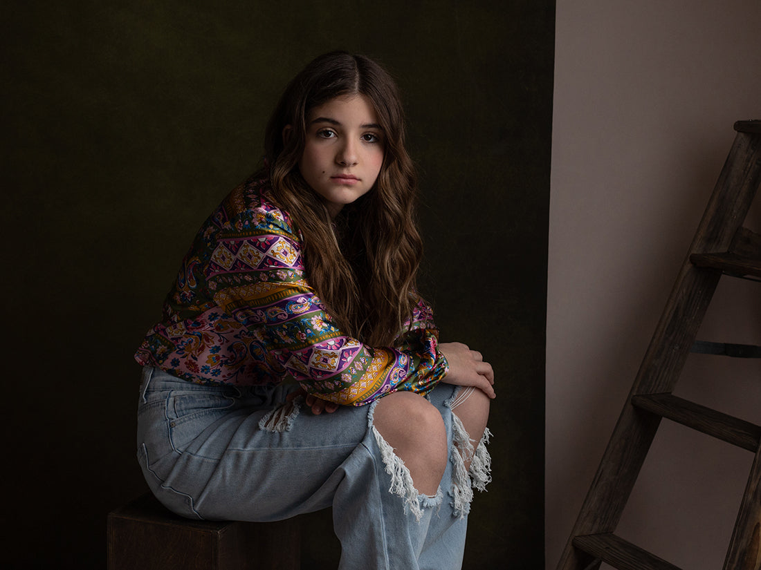
For the first set up, I used a single light approach. You’ll see one 5’ octobox feathered in front of the subject. Feathering is when the back of the light lines up with the front of the subject. The majority of the light is in front of the subject. This dramatically reduces hot spots and also creates depth and contrast in shadows.

Due to the feathered position of the light, the backdrop is getting virtually no light and becomes quite dark. This is neither good nor bad, just something to observe. You may find the color of the drop looks muddy or dull but your subject looks moody and dramatic.
 SOOC
SOOC
For me, the straight out of camera image was too dark (yes, I purposely underexposed it) and the shadows were too harsh. In post, I lifted shadows and exposure.
Here is the final image:

The second scenario is to angle the light slightly towards your subject which will help cast more light on the entire set, including the backdrops. I’ve also added a V-Flat (studio must have!) opposite the strobe to bounce light back onto the set and fill harsh shadows.

As you can see, the SOOC is a tad more evenly lit and shadows are softer.

The final image was easier to achieve will less editing but still shadow lifting and exposure adjustments.

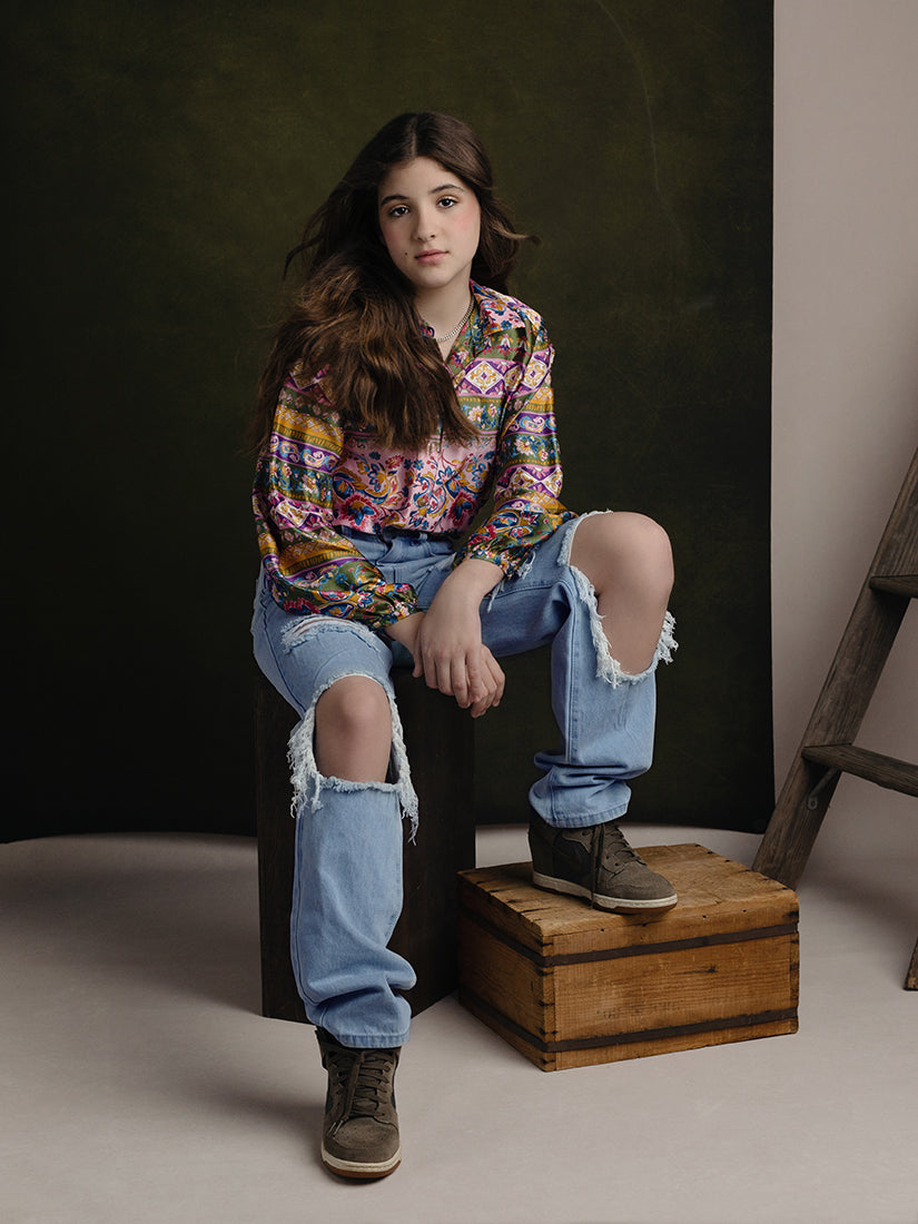
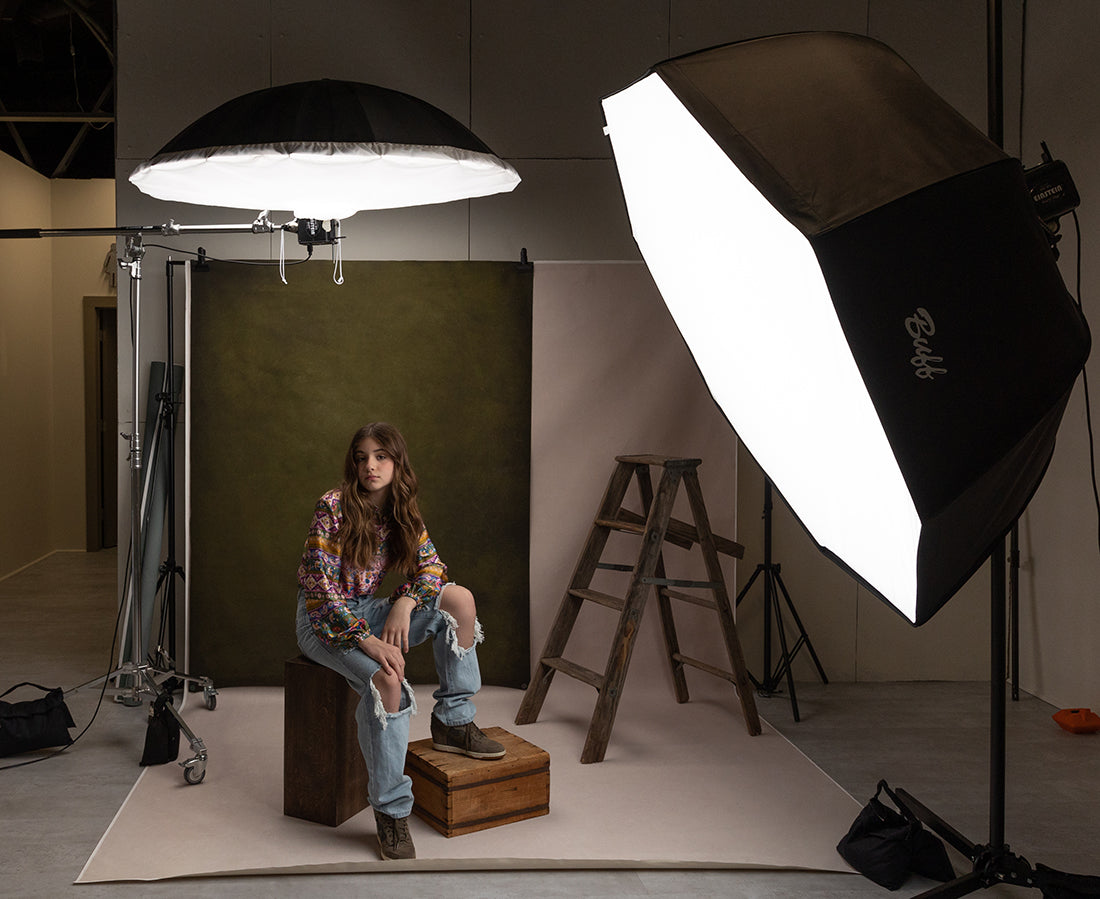
The third scenario is to add a second light. This is my personal favorite because it adds light more evenly across the image, enhancing the colors in the backdrop, while still providing flattering light for our subjects. Here, I have kept the 5’ octobox angled slightly towards the subject and added a second light behind the subject using a 64” umbrella. The second light illuminates the backdrop, fills in harsh shadows and also adds a pretty rim light on the hair of the subject.

Here you will see the color of the backdrop is more vibrant, the subject is brighter and the shadows are softer.
 SOOC
SOOC
Do you see the subtle highlights on her hair? Using the 2 light set up, less editing was required to achieve my preferred esthetic.

Another before and after example with the 2 light set up:
 SOOC
SOOC
Again, very little editing required.

Subtle changes in lighting can make a huge difference in your final image. Hopefully this inspires you to play around or tweak what you are already doing. I mean, let’s face it, as photographers, are we ever completely content with our current process?!?!

About the Author
Based in the suburbs of Philadelphia, Julia photograph's the precious journey of pregnancy, newborn baby and through baby's first year of life. Her goal is to create art for families that is classic and timeless.
Leave a comment
Comments will be approved before showing up.
Also in Blog

MAXIMIZING YOUR STUDIO SPACE TO OFFER YOUR CLIENTS CREATIVE VARIETY WITH MIGUEL MORNA FREITAS
August 26, 2023 3 min read
Read More
Mini Sweep Photography Backdrops
June 24, 2023 3 min read
As a photographer, one of the most important elements of a successful shoot is the backdrop. A backdrop can transform a dull and uninteresting space into a stunning and professional-looking environment. Whether you're shooting portraits, product photography or still life, a backdrop is a must-have tool in your kit. In this blog post, we'll explore why backdrops are important and how to use them to take your photography to the next level and why I love the mini sweeps so much.
Read More

The Ultimate Guide to Multipurpose Holiday Backdrops for Stunning Year-Round Portraits with Zsa'nee Gaines
June 17, 2023 3 min read
I get tired and bored with photographing the same thing day after day and client after client. However, buying a new backdrop for every occasion or because I’m bored doesn’t help the financial books.
Read More
